
I help small publishers, indie brands, and cultural institutions look the way they sound.
I am a brand and editorial designer working mostly in print and identity. Quiet, type driven, and built to last.
About
A little about how I work and who I work with.
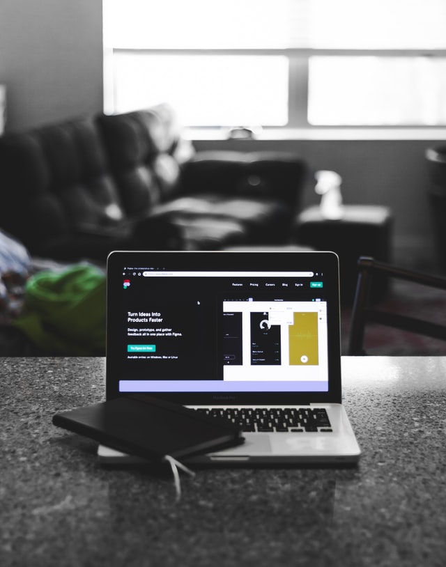
Type that does the quiet work of making a thing feel finished.
I am a brand and editorial designer based in the Pacific Northwest. My work lives mostly in print and identity, with the occasional small site. I care a lot about typography, and only a little about trends.
I take on four to six projects a year, mostly with publishers, indie brands, and cultural organizations. If your project is in that neighborhood, I would love to hear about it.
Most of what I make is meant to be held: books, identities, printed matter. The rest is built to feel just as considered.
Working quietly out of the Pacific Northwest.

What I Do
Three things I am asked for most often.

Brand Identity
Marks, type systems, and the small rules that hold a brand together across everything it touches.

Editorial and Print​
Mastheads, section templates, and page systems for magazines, journals, and reports.

Type and Layout
Typesetting, specimens, and packaging where the typography has to carry the whole thing.
A Note on Process
Small batches, close attention, and a bias toward print.
Most projects run a few unhurried weeks rather than a frantic few days.
How I Work
A small practice, run deliberately.
Step one
I start by reading the thing and the room it lives in before I draw anything.
Step two
Type comes first. The structure of a project usually settles once the type is right.
Step three
I build a small set of rules so the work holds together without me hovering over it.
Step four
Then the object itself: the cover, the mark, the printed piece, made with care.
Step five
I leave behind files and notes tidy enough that the next person can run with them.
Selected Work
A few recent projects, mostly print and identity.
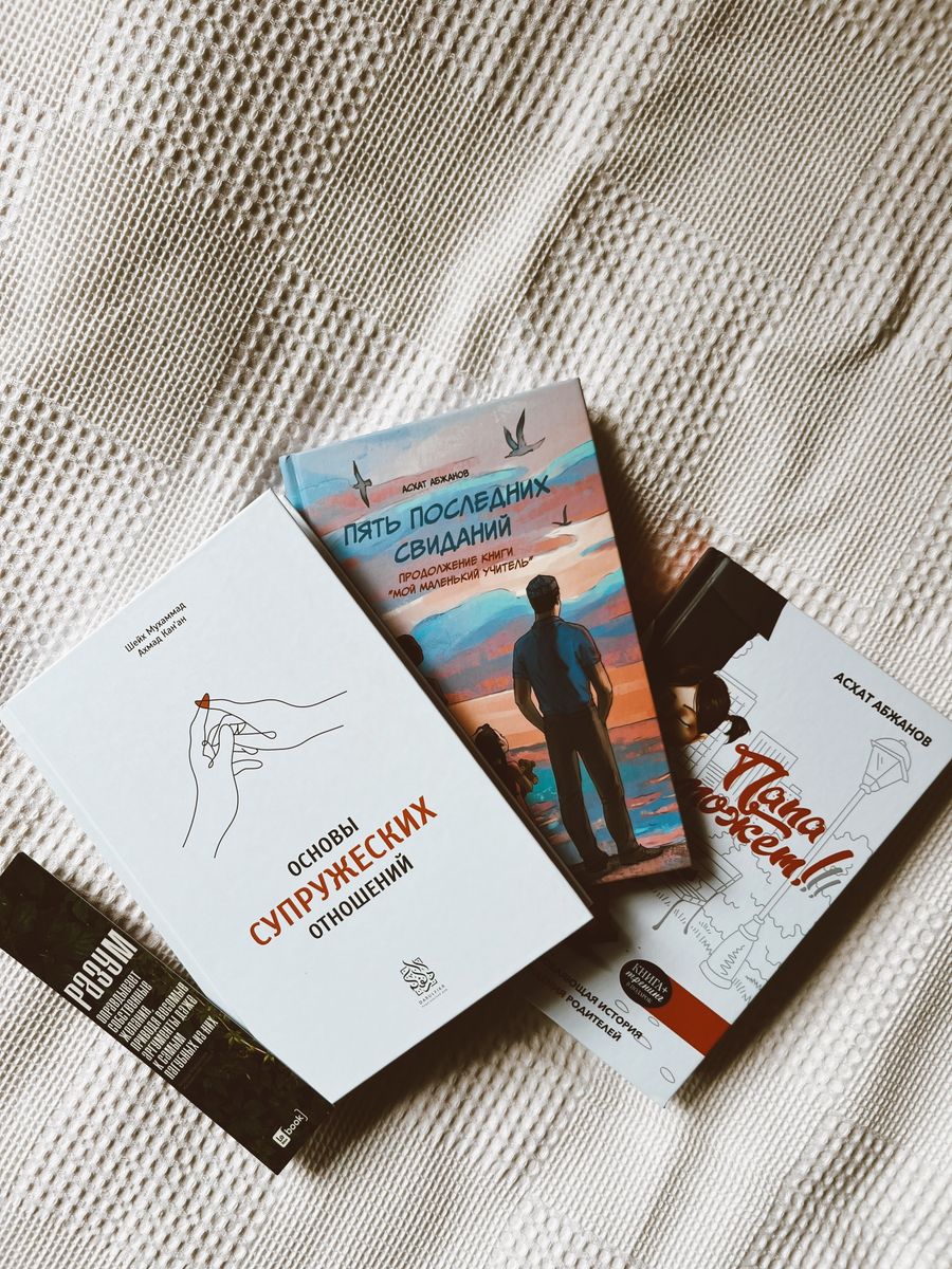
Halcyon Press
Book cover system
Cover redesign for a small literary publisher’s reissue series. Twelve titles, one shared visual grammar.
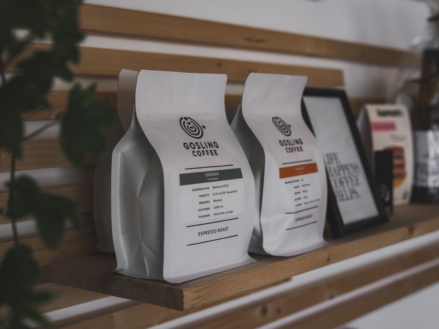
Brushcreek Coffee
Brand identity
Full identity for a single-origin roastery. Mark, type system, packaging, signage.
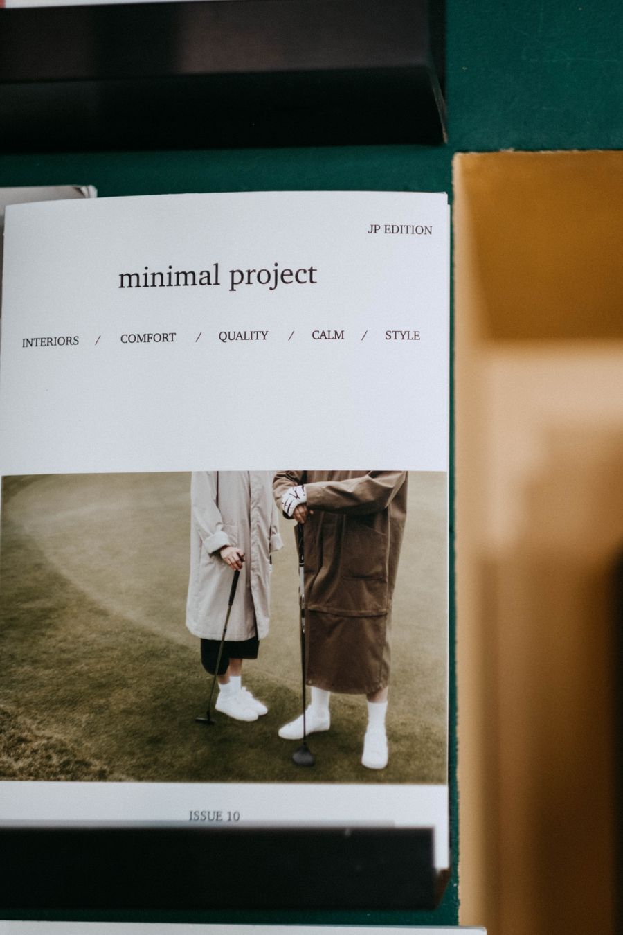
The Civic Quarterly
Editorial system
Masthead and section template for a new longform civic affairs publication.
Marlowe & Holt
Stationery packaging
Packaging system for a small stationery brand. Letterpress production, two-color throughout.
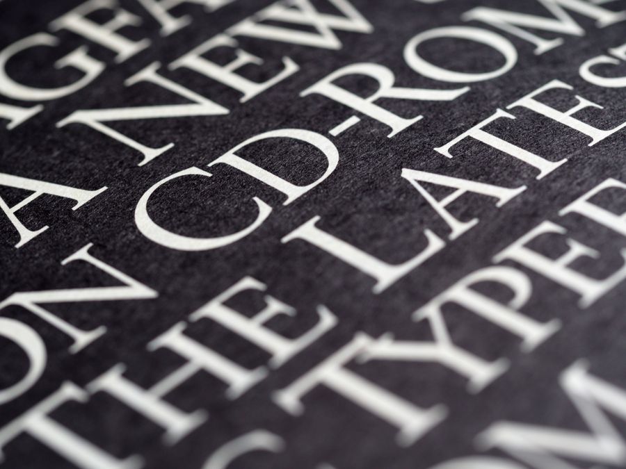
Northbeach Library
Annual report
Typographic system and cover for a 64-page report aimed at donors and city council.
What Clients Say
A few words from people I have worked with.

Maya gave our reissue series a spine. Twelve books that finally look like they belong together.
Elena Marsh
She is calm, exact, and genuinely good with type. Our masthead has never looked better.
David Okafor

The packaging she designed gets picked up and turned over. That is the whole point.
Ruth Calloway
Get in Touch
If you have a project in publishing, identity, or print, I would love to hear about it.
